Monday, 17 December 2012
Artist Inspiration
I've caught the germs that have inhabited the studio! This calls for one thing bed, a cuppa and artist inspiration. The perfect excuse to get cosy and look at websites such as welovetypography.com and thedieline.com for my artist inspiration, it's hard to make decisions on what piece of work is better than another but i'll give it ago!
Friday, 14 December 2012
Making Waves App
Another gradient? Add a little drop shadow? I must be working on my app! It carries on from our previous identity project I'm trying t make mine look as authentic as possible to make it fit in with apples aesthetics. So for my sailing company I've decided to make a logbook where you would be able to document your holiday day by day, adding comments, photo's, locations etc. Now I need to crack on and stop being distracted by Christmas shopping...
Friday, 7 December 2012
Live and Kicking!
My website is Live! Quite proud that I managed to make a website (even if the design is dead simple!) Anyway i've still got a few things to sort out but it should all be finished by next week! www.katy-hill.co.uk
Friday, 30 November 2012
Corporate Identity
I just stumbled across a blog full of corporate identity guidelines, I wish I'd found it a weeks ago!
imjustcreative.com
imjustcreative.com
Monday, 26 November 2012
Sunday, 25 November 2012
Corporate Identity
I chose to create an identity for a sailing holiday company, providing holidays in the Western Isles. I wanted create a luxury feel to the brand. I had to create a logo and also a set of guidelines so the identity could be replicated easily.
Art Direction
Based on the theme 'Eternal' I had to plan and complete a photoshoot, where the images would be used editorially for a Magazine I had created. I decided to look at patterns in natural, this lead me to want to take close-up, macro photographs to explore this. Here are some of the pre-edited results:
Brrrrrr! It's cold out there...
To kick start second year we had a few fast paced weeks of editorial design, I feel like I learnt a lot but I also leant that editorial design is much more harder than it seems - it's all in the detail! This is my splash and turn page of an article based on the Arctic.
Blog Neglection
My blog has been well and truly neglected! I'm going to make an early New Years resolution to give my blog much more TLC and time! This blogs going to be a work in progress alongside my website to try and make the two work well together. I'm sorry blog!
Friday, 18 May 2012
Genius Products
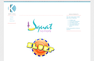
A Nixon/Hill collaboration! We were asked to create names and logo's for some 'genius' products here are some of the results:
'MyPound' a social network site for pets
'Phuck...that's clean!' An acid based cleaner
'Slap' A DIY filler/beauty product
'Squat no more' A female urinal
I love lamp...
Using an object of our own choice we had to document the process of taking it apart and assembling it again. The idea was to not assume a photograph was a finished piece or editing on photoshop produced the final outcome, working on top of printouts created on interesting effect.
Wednesday, 28 March 2012
Paper Toys
For the latest brief we are asked to create 'designer toys' out of paper, I've never really looked into the world of paper toys however just from a quick search on google there are loads of skillfully made toys out there...
Here's a few that caught my eye:
Here's a few that caught my eye:
Wednesday, 29 February 2012
Monday, 27 February 2012
Observations about hoovering
For the 'degree's of sticky' brief I was given the subject of a vacuum cleaner, it could seem like quite a boring subject matter however when thinking about observations and the 'truth' about hoovers it can actually be quite funny - I remembered this sketch by Micheal McIntyre which contains observations about the use of hoovers.
Friday, 17 February 2012
Vaughan Oliver
Vaughan Oliver is one of the most influential designers of cd covers and music related design. He uses expressive typography which he combines with dark and striking photography.
Wednesday, 15 February 2012
Monday, 13 February 2012
Jeffrey Fisher
Jeffrey Fisher's work featured in todays lecture, Layers of subdued colour give an atmospheric appearance and his hand-rendered type also creates an interesting effect
Subscribe to:
Comments (Atom)


